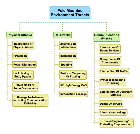
As a part of our threat modeling work, which we do sometimes as a stand-alone activity or as part of an deeper assessment, we often build simple mind maps of the high level threats we identify. Here is an example of a very simple diagram we did recently while working on a threat model for pole mounted environments (PME’s) for a utility client.
This is only part of the work plan, but I am putting it forward as a sort of guideline to help folks understand our process. In most cases, we continually expand on the diagram throughout the engagement, often adding links to photos or videos of the testing and results.
We find this a useful way to convey much of the engagement details with clients as we progress.
Does your current assessment or threat modeling use visual tools like this? If not, why not? If so, drop me a line on Twitter (@lbhuston) and tell me about it.
Thanks for reading!

